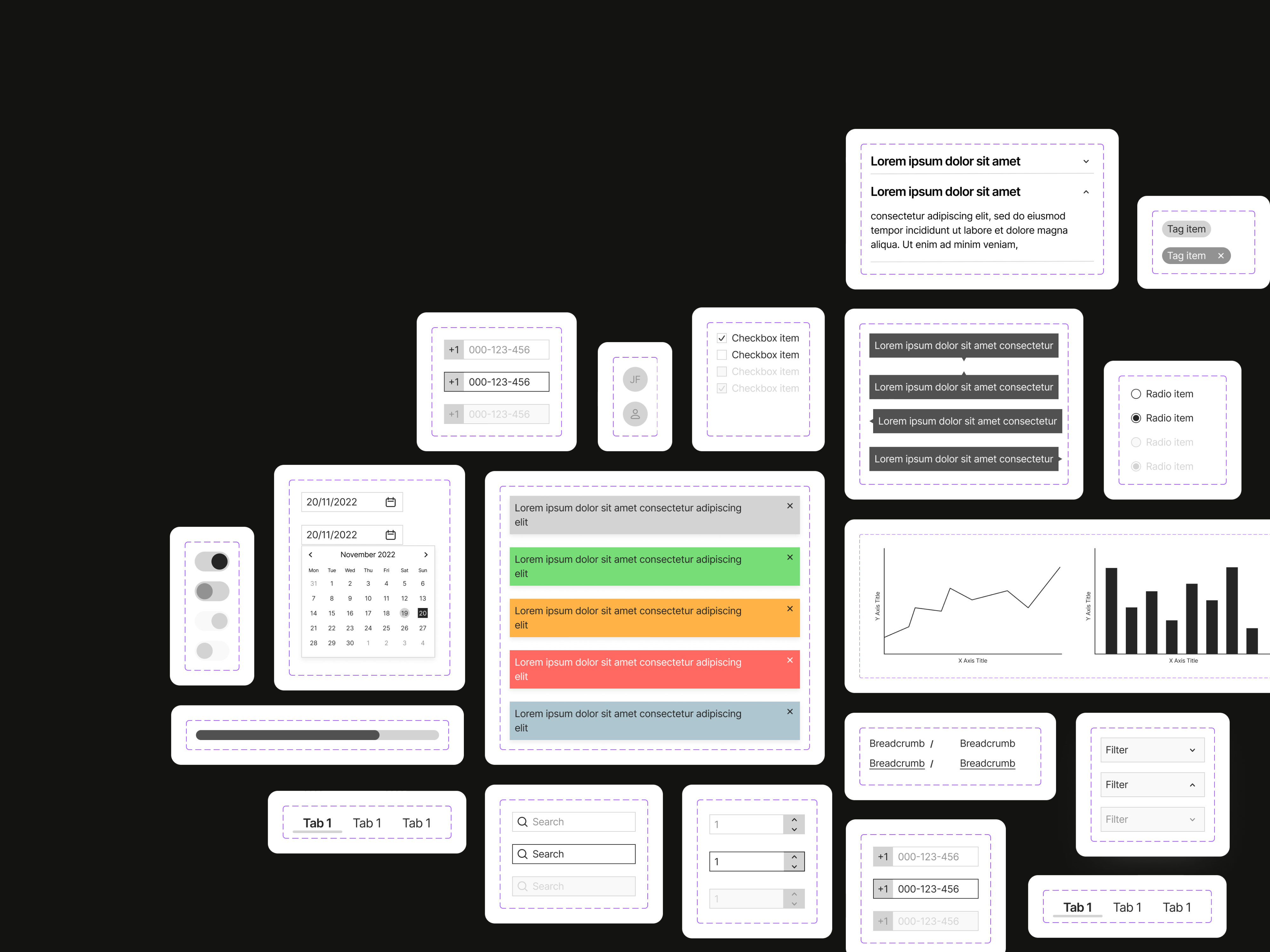
A quick and easy template to start all your designs following the 8pt grid design system
The “8pt Grid” design system is a popular approach used in user interface (UI) design to create consistent and visually harmonious layouts. It is based on the concept of spacing and alignment using an 8-pixel increment
In this system, UI elements such as buttons, text, images, and containers are sized and positioned based on an 8-pixel grid. The grid acts as a framework for determining the dimensions and positioning of various elements on a screen, ensuring a consistent and organized appearance across different devices and screen sizes.
The key principle of the 8pt Grid design system is that all spacing, padding, and margins between UI elements should be multiples of 8 pixels. This approach helps maintain visual harmony and consistency throughout the design. By adhering to this grid, designers can easily align and stack elements, creating a balanced and visually pleasing layout.
The 8pt Grid design system is flexible and adaptable, allowing designers to scale and adjust elements to fit different screen sizes and resolutions. It promotes a systematic and efficient approach to UI design, making it easier for designers and developers to collaborate and maintain a coherent design language.
Overall, the 8pt Grid design system provides a framework for creating visually consistent and scalable interfaces, enhancing usability and user experience across various devices and platforms.
Includes grid / layout setups for the following screens:
-
375x812 - Mobile Regular
-
414x896 - Mobile Large
-
768x1024 - Tablet
-
1024x768 - Desktop Small
-
1440x900 - Desktop Regular
-
1920x1080 - Desktop Large